
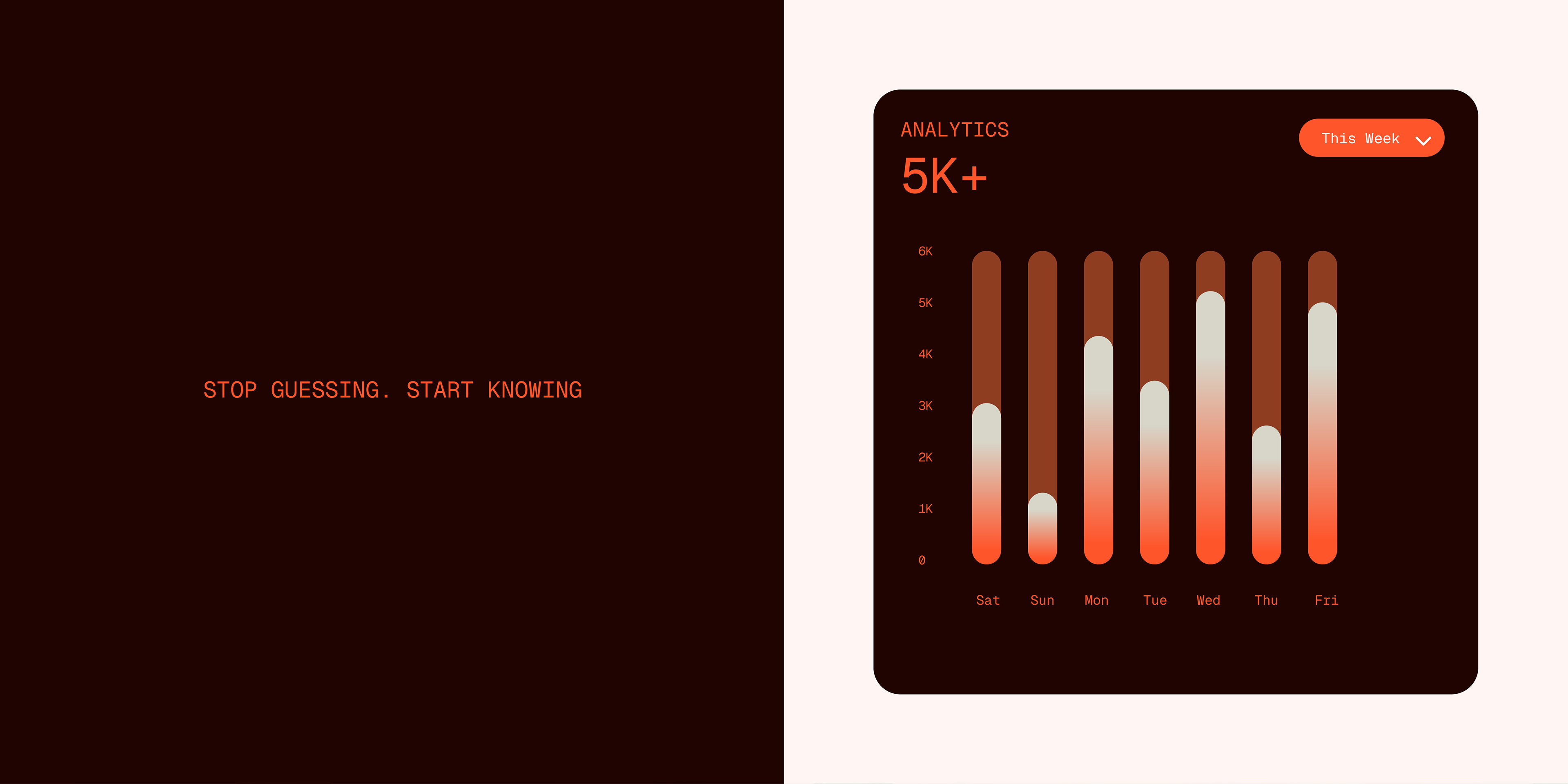
ARA Business Intelligence operates in a category that rarely stops to question itself. Most BI solutions for Language Service Providers speak the language of technology: dashboards, data lakes, automated reports. What they don't speak is the language of the business itself: margins by contract, profitability by language pair, the real cost of a client that looks profitable but isn't. ARA was born from inside that gap, founded by someone who had been a Director of Resources and Cost Analysis at a major US LSP and knew exactly what decision-makers were missing at 11pm before a board meeting.
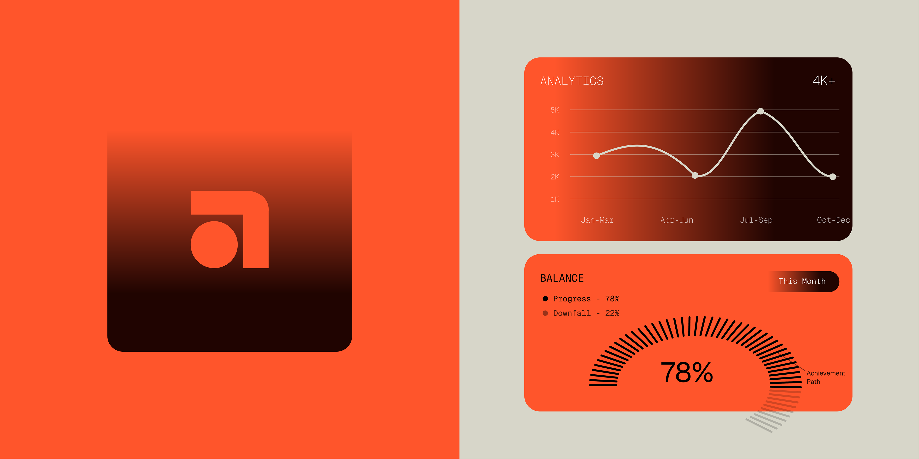
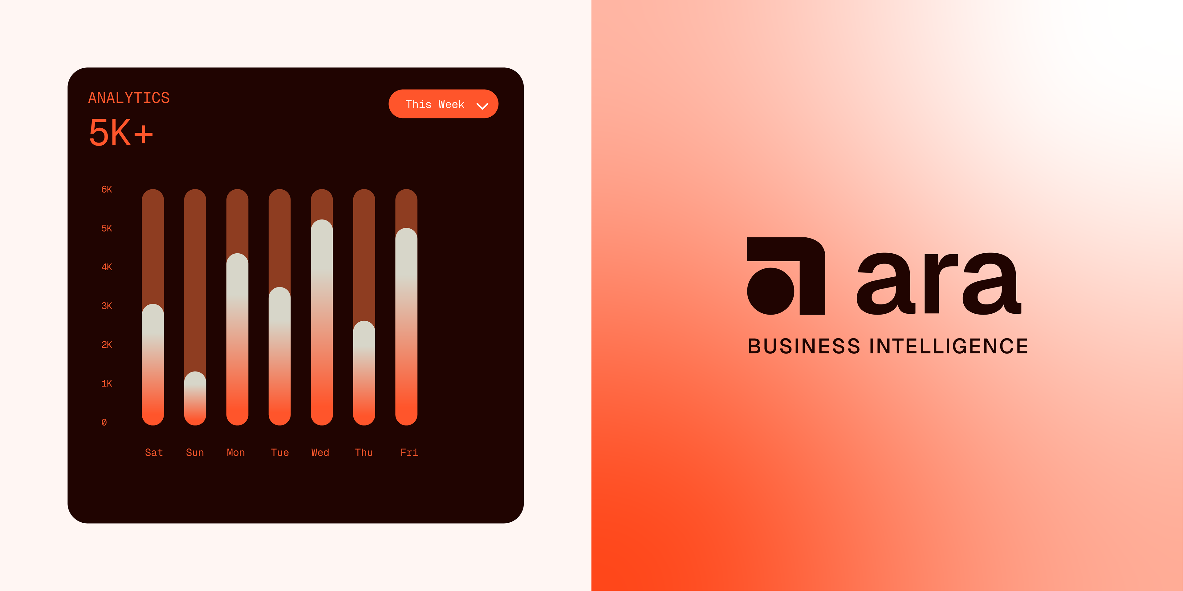
The challenge was building a brand that felt as sharp as the service. Not a generic BI consultancy, not a tech startup trying to look enterprise. Something that communicated precision, confidence and a direct relationship with the people running these businesses. We developed a complete brand identity for ARA: strategy, logo system, and visual language. The result is a visual world anchored in a bold, unmistakable orange over near-black, a palette that reads as urgency without noise, energy without chaos. The icon, a compact geometric form derived from the letter A, carries both analytical rigor and forward movement.

Every element of ARA's identity was designed to make a very specific person, the founder or director of a small to mid-size LSP, feel immediately understood. Not sold to. Understood.